Accelerating the design system in one of the biggest mergers in decades.
Role: Lead Product designer
Client: Virgin media O2

Improving workflows and moving into Figma
Virgin media has been merged with O2. What that means in the product world is that the product teams are currently improving and aligning tools and processes. The O2 design team is currently using Sketch on their day to day work. The design system has been built in Sketch as well.
The main objective was to create a centralised place to host the O2 design system, all design mockups and assets, easy developer hand off, design feedback built in, multiple designers to work on a design in real time and to work in the browser as well as windows and Mac natively.

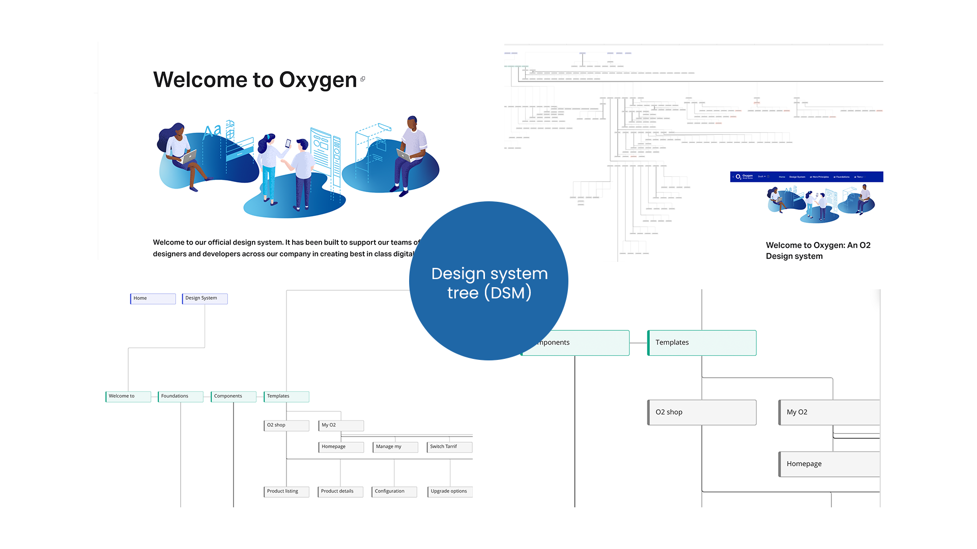
The first thing was to audit the O2 design system on its current architecture (Sketch library) including the monument website hosted on Invision Design system manager. This gave me and the wider team a good estimation of the scope of work that had to migrate to the new platform – Figma. That included documentation, component built, identifying patterns, onboarding process and the contribution model. Everything was mapped down on miro. Not only it helped me split this massive task into subtasks, helping prioritising and estimating timings and effort but also to understand and map out components behaviour and variations.


“Thanks for all your hard work on the ODS and especially the patterns work, which we are now building out. It was a pleasure working with you, all the best in your new adventure”
Nicolas Lamp – Lead UI/UX at Virgin Media O2

Identifying patterns on eComm and eCare
After auditing the Oxygen Design system one of the most important outcomes, was the absence of organisms or patterns. Product teams were working on pages using existing templates within their own squads. I run several workshops to identify pain points with the wider design and copy teams both on eComm and eCare (My O2) products. I fully mapped down these common patterns as well as the addition of a new section under content for copywriters to start shaping a content design system, resulting on improved workflows, clarity and alignment. After all content is king!

495 pages audited, 200+ components and patterns built in Figma, over 150 hours consumed in meetings and workshops, over 4000 words written, 40+ donuts consumed and 100+ double espressos.


Design systems take time to mature and evolve. They require continues engagement with the product teams in order to do that.
Changing the O2’s operating model from centralised to federated helped breaking the silos and improve communication within different teams.
I was the key contact point for any new requests, bugs, design reviews and operations. Bridging that gap and initiated the addition of a content design system that helped increasing transparency and improved workflows between copy and design.
Re-building the components from scratch in Figma required a lot attention to detail, good planning and strong information architecture skills apart from UI/UX. Naming conventions especially for patterns required strong alignment with the teams and their input (user feedback) really formed those patterns and increased findability. Communication and transparency was the key. Setting up the right foundations in Figma, understanding where we are and what to improve and how to plan ahead as a team was the key to succeed one of the most important milestones.

If you’re interested in discussing a project email me at hello@chrisbinou.com or message me on LinkedIn I will reply within 24 to 48 hours.